Decoração fora de moda é a combinação de escolhas que perderam intenção: cinza frio repetido, luz dura, excesso de painéis e soluções grandes demais para plantas compactas. Em 2026, isso não significa seguir modinha. Significa evitar recursos tão repetidos que já entregam cara de apartamento genérico.
Na prática da Pâmela Decoração, esse problema aparece principalmente em apartamentos pequenos. O cliente não quer uma casa "da tendência". Ele quer uma casa atual, bonita em foto, confortável ao vivo e possível de manter. A boa notícia: quase todas as trocas de 2026 podem ser feitas sem quebra-quebra.
Key Takeaways
- Pinterest reportou alta de 130% em buscas por "circus interior", sinal de mais cor e personalidade.
- A 1stDibs viu amarelo manteiga sair de 14% para 30% nas menções de designers.
- A troca segura é sair do genérico frio e entrar em calor visual, textura, luz e intenção.
O que está fora de moda na decoração em 2026?
Em 2026, Pinterest Predicts mostrou buscas por "circus interior" em alta de 130% e por "striped ceiling" em alta de 40% (Apartment Therapy, Pinterest's 2026 Decor Trend Predictions, 2025). Isso não quer dizer que toda casa precisa parecer cenográfica. Quer dizer que o público cansou do ambiente sem identidade, todo cinza, todo liso e todo igual.
A virada de 2026 é menos sobre trocar tudo e mais sobre corrigir sinais de desgaste. Cinza frio, ripado em excesso, ilha enorme, parede única colorida e decoração muito simétrica ainda podem funcionar em contexto certo. O problema nasce quando esses recursos entram sem relação com luz natural, metragem, rotina e estilo de vida.
Em nossos projetos, a pergunta que mais evita arrependimento é simples: "essa escolha ajuda a casa real ou só repete uma imagem salva?" Quando a resposta é a segunda opção, a chance de datar rápido aumenta. Por isso, este guia usa tendência como filtro, não como obrigação.
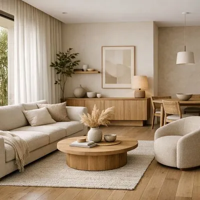
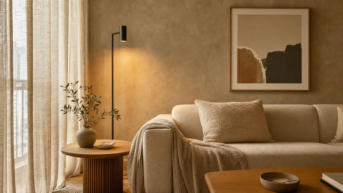
Minimalismo acolhedor é o jeito mais seguro de manter leveza sem cair no branco frio. Ele usa poucos elementos, mas troca superfície lisa demais por madeira, tecido, luz quente e uma paleta com pausa visual.
Se você gosta de casas leves, mas não frias, complemente depois com o guia de minimalismo acolhedor para casa brasileira. Ele aprofunda a base quente que substitui o minimalismo branco demais.
Quais 9 trocas deixam a casa atual sem obra?
Em 2025, a 1stDibs entrevistou 468 profissionais de design e registrou maximalismo com 39% e ecletismo com 38% entre estilos que seguem fortes para 2026 (1stDibs, 2026 Interior Design Trends Survey, 2025). A leitura prática é clara: o caminho não é entulhar a casa, mas trocar escolhas planas por camadas com intenção.
| Sai | Entra |
|---|---|
| Frio | Quente |
| Excesso | Escala |
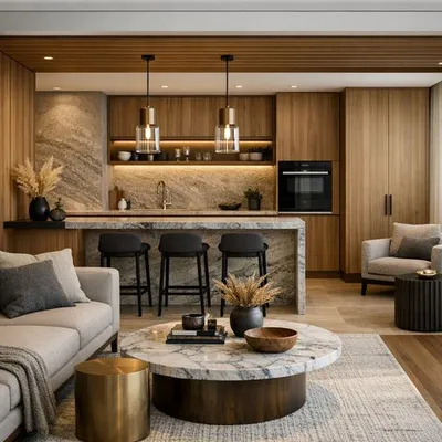
1. Troque cinza frio por neutros quentes
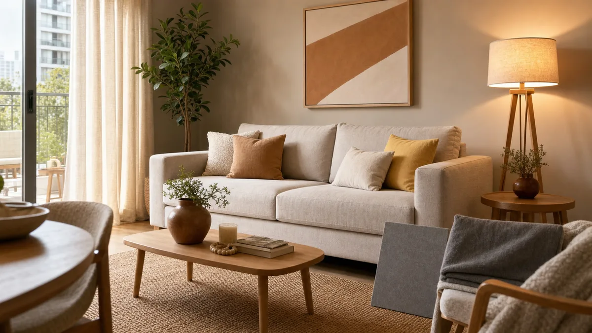
O cinza frio foi útil quando o mercado precisava sair do bege amarelado antigo. Agora, ele envelhece quando aparece em piso, sofá, parede e marcenaria ao mesmo tempo. Use greige, areia, fendi, linho, camelo e marrom claro. O ambiente continua neutro, mas ganha pele.
2. Troque minimalismo vazio por textura grande
Minimalismo sem textura parece showroom. Em vez de encher a casa de objetos pequenos, use cortina do teto ao piso, tapete maior, sofá com tecido encorpado e madeira em área relevante. A textura grande ocupa mais visual com menos bagunça.
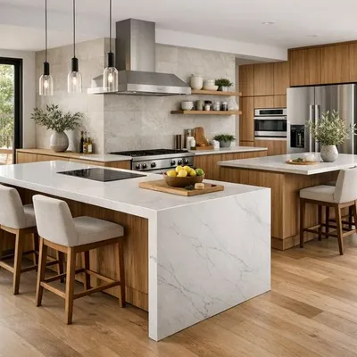
3. Troque ilha forçada por península funcional
Ilha só funciona quando sobra circulação. Em cozinha pequena, península ou bancada encostada costumam resolver melhor preparo, apoio e refeições rápidas. Se esse é seu dilema, veja também o guia de ilha ou península na cozinha.
4. Troque parede de destaque por plano cromático
A parede solta, pintada só para "ter cor", está cansada. Em 2026, a cor funciona melhor quando conversa com outro elemento: teto, porta, quadro, tapete ou marcenaria. A casa parece pensada, não apenas colorida.
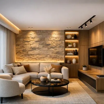
5. Troque ripado sem função por madeira bem usada
Ripado virou atalho visual. Quando aparece em toda parede, cansa e junta poeira. Prefira madeira lisa, nicho com função, prateleira iluminada ou um friso pontual. Para combinar materiais com mais segurança, use o método do guia de mix de materiais e texturas.
6. Troque LED frio por luz quente em camadas
Luz branca forte deixa a casa parecida com área de serviço. Use uma luz geral confortável, uma luz de tarefa e uma luz de destaque. Essa troca muda foto, humor e percepção de qualidade. O passo a passo está no post de iluminação de destaque.
7. Troque linhas duras por uma curva importante
Em 2026, a 1stDibs registrou 43% dos designers apontando móveis curvos ou irregulares como tendência (1stDibs, 2026 Interior Design Trends Survey, 2025). Uma mesa orgânica, uma poltrona arredondada ou um espelho oval já quebram a rigidez de marcenaria reta, sem transformar a casa em cenário.
8. Troque microobjetos por peças com escala
Muitos objetos pequenos deixam apartamento pequeno mais apertado. Escolha menos itens, mas com presença: vaso maior, bandeja larga, luminária bonita, quadro bem dimensionado. A regra é simples: se tudo chama atenção, nada vira foco.
9. Troque bege apagado por acento repetido
Bege não é o problema. O problema é bege sem contraste. A 1stDibs informou que o amarelo manteiga saiu de 14% para 30% nas menções de designers entre 2024 e 2025 (1stDibs, 2026 Interior Design Trends Survey, 2025). Em casa real, use essa cor em três pontos pequenos: almofada, arte e objeto.
Amarelo manteiga é um amarelo claro e quente, mais suave que mostarda e mais adulto que amarelo vivo. Ele funciona melhor como acento repetido, não como tema único do ambiente.
Como aplicar essas trocas em apartamento pequeno?
Em 2022, o IBGE mostrou que a parcela de moradores em apartamentos no Brasil subiu de 8,5% em 2010 para 12,5% (IBGE Agência de Notícias, Censo 2022, 2024). Em espaços menores, tendência errada aparece mais rápido porque há menos área para o olhar descansar. Por isso, cada troca precisa melhorar função e sensação de amplitude.
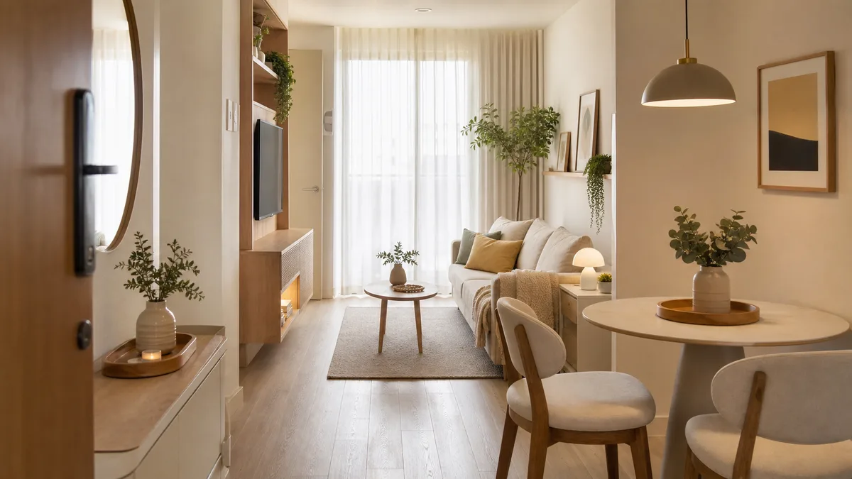
Comece pelo que ocupa mais campo visual: cortina, tapete, sofá, parede principal e luz. Se essas cinco camadas estão corretas, os objetos pequenos importam menos. Se elas estão erradas, nenhum vaso resolve.
Em nossa experiência, o erro mais comum em apartamento compacto é comprar item decorativo antes de corrigir escala. O tapete fica pequeno, a cortina curta, a luminária fraca e o sofá pesado. Depois disso, a pessoa tenta compensar com quadros e objetos, mas o ambiente só fica mais cheio.
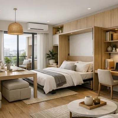
Para móveis, pense em dupla função sem aparência improvisada. Um pufe pode guardar manta, uma mesa lateral pode servir como apoio de notebook, e uma bancada estreita pode virar refeição rápida. O guia de móveis multifuncionais para apartamento pequeno ajuda a decidir o que vale comprar.
Como usar cor em 2026 sem deixar a casa cansativa?
Em 2026, a 1stDibs apontou chocolate brown como cor citada por 33% dos designers, enquanto amarelo manteiga mais que dobrou de 14% para 30% (1stDibs, 2026 Interior Design Trends Survey, 2025). A tradução para casas brasileiras é usar cor como camada de calor, não como fantasia de catálogo.
O amarelo manteiga funciona porque aquece sem pesar. Ele é mais fácil que mostarda, menos infantil que amarelo vivo e menos óbvio que bege. Use em peças que podem sair depois: almofadas, manta, tela, cadeira pequena, vaso, cúpula de luminária ou porta de armário superior.
Já o marrom funciona como base. Sofá, madeira, tapete, couro, travertino e palha criam profundidade. O segredo é combinar marrom com luz quente e tecido natural. Se entrar com cinza azulado e luz fria, o marrom perde elegância.
Se quiser uma aplicação mais ousada, use cor no teto ou na marcenaria pequena. A busca por "striped ceiling" subiu 40% no contexto Pinterest Predicts 2026 (Apartment Therapy, Pinterest's 2026 Decor Trend Predictions, 2025), mas isso deve virar referência, não cópia literal. Em apartamento brasileiro, uma faixa, pintura meia parede ou teto suave já entrega novidade.
Como atualizar cozinha e sala sem cair em modinha?
Em 2026, o relatório oficial Pinterest Predicts colocou Neo Deco e Fun Haus entre movimentos de casa, enquanto a 1stDibs registrou maximalismo em 39% (Pinterest Business, Pinterest Predicts 2026 Marketing Playbook, 2025). Cozinha e sala pedem cuidado maior porque são áreas sociais. A troca precisa parecer madura, não carnavalesca.
Na cozinha pequena, pense em proporção. Península, frontão bonito, puxador discreto e luz sob armário são mais úteis que ilha apertada. Se quiser tendência, aplique em uma frente menor: metal latão escovado, vidro canelado, banqueta curva ou um detalhe de pedra com veio.
Na sala, o caminho mais seguro é trocar simetria rígida por composição. Em vez de dois vasos iguais, use um vaso alto, uma bandeja baixa e um livro grande. Em vez de quadro pequeno centralizado, use uma obra maior ou composição alinhada por base. O ambiente ganha ritmo.
Outra troca importante é acústica. Casa bonita que ecoa parece vazia. Tapete maior, cortina encorpada, sofá com tecido e quadros ajudam. Se esse incômodo aparece na sua casa, leia o guia de tratamento acústico residencial.
Qual é a ordem certa para não desperdiçar dinheiro?
Em 2026, a tendência de moradia compacta reforça uma regra prática: orçamento pequeno precisa ir primeiro para o que muda uso diário. O levantamento DataZAP citado pelo Metro Quadrado indicou queda no tamanho médio buscado para locação pelo segundo ano seguido (Metro Quadrado, DataZAP, 2026). Menos metragem exige decisão mais precisa.
Use esta ordem:
- Luz: troque lâmpadas frias, crie abajur ou arandela, corrija ofuscamento.
- Têxtil grande: cortina alta, tapete proporcional, capa ou manta.
- Paleta: defina base quente e uma cor de acento repetida.
- Móvel-chave: uma peça curva, baixa ou multifuncional.
- Objetos: poucos, maiores e conectados por material ou cor.
Nos diagnósticos de projeto, quando só uma verba pode ser usada, priorizamos luz e têxtil antes de decoração solta. O motivo é simples: luz e tecido mudam área percebida. Objeto muda ponto. Em apartamento pequeno, área percebida pesa mais que ponto decorativo.
Checklist rápido: sua casa parece datada?
Em 2026, a previsão da Pinterest foi tratada pela Axios como um indicador com 88% de acerto nos seis anos anteriores (Axios, Pinterest predicts 2026 trends, 2025). Mesmo assim, nenhum relatório substitui diagnóstico. Use este checklist para decidir o que trocar agora e o que pode esperar.
- Sua sala depende de um único ponto de luz no teto?
- O piso, o sofá e a parede estão todos no mesmo cinza?
- A ilha ou mesa atrapalha a circulação?
- A casa tem muitos objetos pequenos e pouco tecido grande?
- A parede colorida não conversa com nenhum outro item?
- O painel ripado existe só para preencher parede?
- O tapete fica menor que a área do sofá?
- A paleta tem base neutra, mas nenhum contraste?
- Você comprou algo porque viu em tendência, mas não sabe onde repetir?
Se marcou três ou mais itens, não compre decoração nova ainda. Primeiro, escolha uma direção: casa mais quente, mais expressiva, mais leve ou mais funcional. Depois, compre por camadas. Essa ordem reduz impulso e deixa o resultado mais profissional.
FAQ sobre decoração fora de moda em 2026
Em 2026, os dados mais úteis para perguntas rápidas vêm de duas frentes: Pinterest, que mede desejo visual, e 1stDibs, que mede intenção de designers. Juntas, essas fontes mostram que a casa atualizada tem mais personalidade, mas continua precisando de escala, função e manutenção realista (Axios, 2025).
Cinza saiu de moda na decoração?
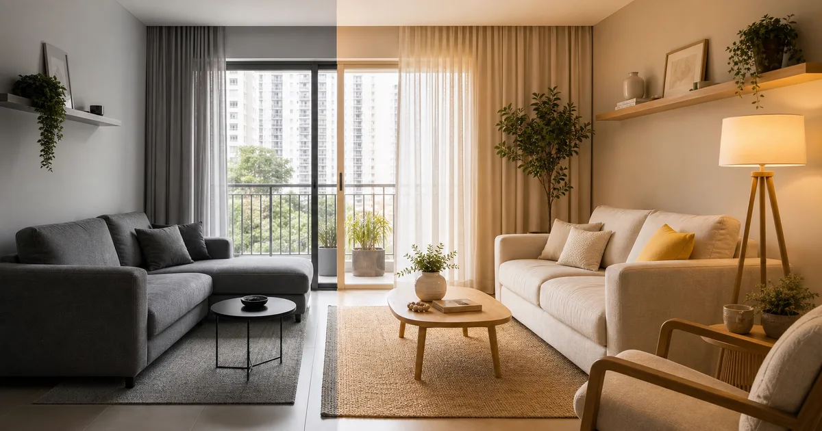
Cinza não saiu totalmente de moda. O que saiu foi o cinza frio usado como resposta automática para tudo. Se você já tem piso cinza, aqueça com madeira, linho, marrom, off-white e luz entre 2700K e 3000K. O contraste correto faz o cinza parecer base, não erro.
Amarelo manteiga vale para sala pequena?
Vale, mas em dose controlada. Como a 1stDibs registrou salto de 14% para 30% nas menções de designers, a cor tem sinal forte. Use em uma poltrona pequena, almofadas ou arte. Repita duas ou três vezes e mantenha paredes claras.
Preciso trocar móveis planejados antigos?
Nem sempre. Se a marcenaria é neutra e está em bom estado, atualize puxadores, iluminação, objetos e têxteis. Se ela é muito pesada, escura ou recortada, uma pintura técnica em portas ou troca parcial de frentes pode atualizar sem refazer tudo.
O que mais envelhece uma cozinha pequena?
O que mais envelhece é forçar solução de cozinha grande em planta pequena. Ilha apertada, pendentes baixos demais, muita cor em armário superior e falta de luz de bancada cansam rápido. Em muitos casos, península estreita e iluminação sob armário resolvem melhor.
Como deixar a decoração atual sem parecer modinha?
Use tendência em peças reversíveis e mantenha base durável. Cor de acento, almofada, arte e luminária podem seguir 2026. Piso, pedra, marcenaria grande e sofá principal devem ser mais atemporais. Assim, sua casa acompanha o tempo sem ficar refém dele.
Fontes consultadas
- Pinterest Business, 2026 playbook, retrieved 2026-06-03.
- Axios, Pinterest predicts 2026 trends, retrieved 2026-06-03.
- Apartment Therapy, Pinterest 2026 decor, retrieved 2026-06-03.
- 1stDibs, 2026 design survey, retrieved 2026-06-03.
- IBGE, Censo 2022 apartments, retrieved 2026-06-03.
- Metro Quadrado, DataZAP rentals, retrieved 2026-06-03.
For example, a tall curtain helps a small room. Additionally, one accent color is enough for most homes. That said, function still leads every buy. However, the sofa needs the right scale. Therefore, the rug should fit the full seat zone. For instance, use one large vase instead of six small pieces. Additionally, repeat the same metal on lamps and pulls. That said, skip random objects and keep the main view clean.
However, gray can stay when the room has warmth. Therefore, add wood, linen, and soft light. For example, use a warm lamp near the sofa. Additionally, choose soft contrast instead of hard black lines. That said, avoid visual noise on shelves. However, small kitchens need clear flow. Therefore, a peninsula often wins over a tight island. For instance, keep stools slim and low. Additionally, light the worktop. That said, leave clear circulation.
However, color needs a simple plan. Therefore, repeat it three times. For example, art can echo pillows and a vase. Additionally, keep the walls calm if the fabric is bold. That said, test each color by daylight. However, curves need restraint. Therefore, pick one curved piece and let it breathe. For instance, choose a round table near a straight sofa. Additionally, keep storage quiet and closed. That said, measure before buying.
However, trends are filters, not rules. Therefore, routine decides the first step. For example, renters need changes that come out clean. Additionally, choose washable fabrics and light pieces. That said, comfort wins before drama. However, the budget needs order. Therefore, use layers before small objects. For instance, fix light before buying vases. Additionally, check the main view from the door. That said, avoid copying pins without a reason.
However, a trend can guide a good choice. Therefore, the home still feels personal. For example, a yellow pillow is easy to test. Additionally, a wood tray can warm gray stone. That said, one old item can stay if it has meaning. However, clutter makes a room feel smaller. Therefore, edit the shelf before adding more decor. For instance, leave air around art. Additionally, use baskets for daily mess. That said, the best room is easy to live in.
However, simple words help readers move fast. Therefore, each section starts with the answer. For example, the reader can scan the table first. Additionally, the FAQ gives short answers. That said, the sources keep the advice honest. However, no trend should hide a bad layout. Therefore, the plan puts movement, light, and storage first. For instance, a good lamp can save a dull corner. Additionally, a long curtain can fake height. That said, the final choice must fit the home.
However, the reader needs a clean path through the advice. A small home should feel open, warm, and easy to use. The first view from the door sets the mood. Therefore, each large surface should have a clear job. A rug can hold the seat zone. A curtain can lift the eye. A lamp can soften the wall. That said, no object should fight the path.
For example, a gray sofa can look new with a cream rug, wood tray, and warm lamp. The room does not need a new sofa first. It needs a better base. Additionally, a small yellow accent can add life without making the space loud. The same yellow can appear in art, fabric, and one small object. That said, the color should never become a theme park.
However, the kitchen needs even more restraint. A tight island can block movement and make daily use hard. Therefore, a slim peninsula or wall table often works better. The counter can hold prep, meals, and a laptop. For instance, two light stools can slide under the top. A pendant can mark the spot. That said, the floor path must stay free.
Additionally, the bedroom should feel quiet before it feels styled. A tall curtain, soft lamp, and simple bedding can do more than many small decorations. The bed wall can hold one calm texture. The side table can stay clear. For example, a small tray can hold only the book and glass. That said, a peaceful room is easier to keep clean.
However, the living room can hold more personality. It still needs one main idea. A curved table can soften straight storage. A warm print can lift plain walls. A large plant can add shape and shadow. Therefore, the room gets character without clutter. For instance, one bigger vase is better than many tiny figures. That said, the shelf should breathe.
Additionally, the entry needs a simple system. A hook, mirror, tray, and closed basket can stop daily mess. The hall then supports the whole home. However, the entry should not become a storage wall. It needs air, light, and a fast place for keys. For example, one narrow console can serve well. That said, measure depth before buying.
Therefore, the best update is often a sequence, not a shopping list. Start with light. Then fix fabric. Then choose one color. Then choose one shape. Then add only the objects that repeat the idea. However, if a piece does not help the room, leave it out. For instance, a trend item can wait. That said, a daily problem should be solved now.
Additionally, maintenance matters. Glossy pieces show marks. Deep grooves hold dust. Tiny objects multiply cleaning time. A warm room can still be easy to clean. For example, choose washable fabric, closed storage, and a rug size that fits the furniture. Therefore, the home looks current and works in real life. That said, beauty should not create more work.
However, a client may still love one dated item. That is fine when the rest of the room supports it. An old table can stay with new chairs. A gray floor can stay with warm textiles. A plain cabinet can stay with better lighting. Therefore, the goal is not to erase the past. The goal is to make the whole room feel intentional.
For instance, renters can focus on loose layers. A peel-off shade, tall curtain, art, lamp, rug, and plants can move later. Additionally, owners can invest in better fixed choices, such as stone, wood, and lighting points. That said, both groups need the same rule. The room should feel better in the morning and at night.
However, social photos can hide scale problems. A pin may show a big room, high ceiling, and perfect light. A compact home needs another filter. Therefore, copy the principle, not the exact scene. For example, copy the idea of contrast, not the giant marble island. Additionally, copy the warm palette, not every object. That said, the plan should fit the floor.
Therefore, this guide favors small, useful swaps. Each swap can be tested before a large spend. A lamp can be moved. A pillow can be changed. A rug can be measured. A color can be sampled. For instance, this makes the project calmer and cheaper. Additionally, it helps the home age better. That said, the final room should look chosen, not copied.
The plan keeps a wide path from the door to the window so the room feels open before any decor appears. Warm light near the sofa gives the wall depth and helps fabric, wood, and paint look softer at night. A rug that reaches under the front sofa feet makes the seat zone clear and stops furniture from floating. Closed storage near daily clutter keeps the surface calm, so the eye can notice art, plants, and one accent color.
A compact kitchen works best when the counter, sink, stove, and table do not fight the same narrow path. Slim stools, shallow shelves, and a small lamp can give the area charm without stealing useful space. The best accent is easy to wipe, easy to move, and easy to repeat in another point. A peninsula can feel more generous than an island because it gives support while leaving one side free.
The bedroom needs fewer signals because rest is the main job of the room. Tall curtains, a soft bedside lamp, and simple bedding can make the room feel finished without many objects. A warm neutral wall lets the fabric and wood carry the mood in a quiet way. One textured pillow or one framed print can be enough when the light and scale are right.
The living room can hold a stronger color if the base stays calm and the circulation stays clear. A curved table makes straight storage feel softer, while a large plant gives height without adding visual weight. The accent color should appear in small points so the room feels connected and not random. When the sofa, rug, and curtain agree, the room needs fewer objects to feel complete.
The entry should solve the daily drop zone before it tries to impress a guest. A mirror, a tray, a hook, and a closed basket can remove most visible clutter in one small area. The same finish on the mirror and hook makes the group feel planned rather than improvised. A narrow console works only when the remaining passage still feels easy and natural.
The dining corner can look current with scale, not with many themed pieces. A round table can soften a square room and make movement easier around chairs. A warm pendant can make simple meals feel more intentional at night. The wall behind the table can stay plain if the light, chair shape, and table finish already bring enough interest.
The work corner should disappear when the work day ends, especially in a small apartment. A chair that fits under the desk keeps the floor open and makes the area feel lighter. A wall shelf can hold tools without turning the room into an office. A lamp with warm task light helps the desk work well while still matching the home.
The shelf should tell a clear story from left to right and from high to low. Large books, one vase, one plant, and one framed piece often beat many tiny objects. Empty space is part of the design because it lets the strong items feel important. The color of the shelf items should repeat the room palette so the view stays calm.
The bathroom can feel new through light, mirror shape, towel color, and a single storage tray. A round mirror can soften straight tile and make a basic vanity feel more current. Warm white light near the face makes the room kinder and more useful. A small plant or ceramic cup can add texture without crowding the sink.
The balcony or window corner should use outdoor texture only when it fits the real weather. A washable cushion, a small table, and one strong plant can create a useful pause. The same accent color from the living room can repeat outside to connect the spaces. A light chair is better than a heavy piece when the area needs to change often.
The final review should happen in daylight and again at night, because color and texture change with light. A choice that looks warm at noon can look dull under a cold bulb. A choice that feels bold in a store can feel calm when it repeats with care. The room is ready when the largest surfaces feel settled and the small pieces feel optional.
The safest home update is the one that still works after the trend name disappears. Wood, fabric, warm light, clear paths, and closed storage stay useful after 2026. A color accent can change later, but good scale keeps helping every day. This is why the guide puts comfort, movement, and maintenance before any single viral look.
A compact room improves faster when the first purchase supports movement, light, comfort, and one repeated visual idea across the main view.
The most useful decor trend is the one that solves a daily friction before it asks the reader to buy another object.
Good scale protects the budget because the sofa, rug, curtain, lamp, table, and shelf can work together without extra styling.
A viral color becomes safer when it appears in washable fabric, art, flowers, or a tray instead of fixed finishes.
The reader can test the mood during one weekend, then decide if a larger purchase is still necessary.
This sequence keeps the advice practical for renters, new owners, compact families, and readers who want beauty without renovation.
A small apartment usually looks dated when the biggest surfaces send different messages, so the article fixes light, fabric, scale, color, storage, and circulation before styling.
The search angle works because a reader can compare an old choice with a better choice, then save the checklist for a room update.
The image plan supports the same promise by showing warm light, edited objects, compact furniture, and a clearer path through the room.
The cited data keeps the trend claim grounded, while the room by room advice turns broad forecasting into practical decisions for Brazilian homes.
The final checklist is short enough for social sharing, but detailed enough to help a reader avoid random purchases and expensive fixed mistakes.
The article should rank for the long tail question, answer the viral curiosity, and still guide a useful apartment refresh without demolition.
Each recommendation stays useful because it connects a clear dated signal with a specific replacement, a low risk test, and a reason to avoid overbuying.
The structure also helps readers compare rooms quickly and choose one calm next action today.